
This is a general overview of the Dashboard to start with.
The revenue chart shows you the sum of your transactions over the past 12 months.
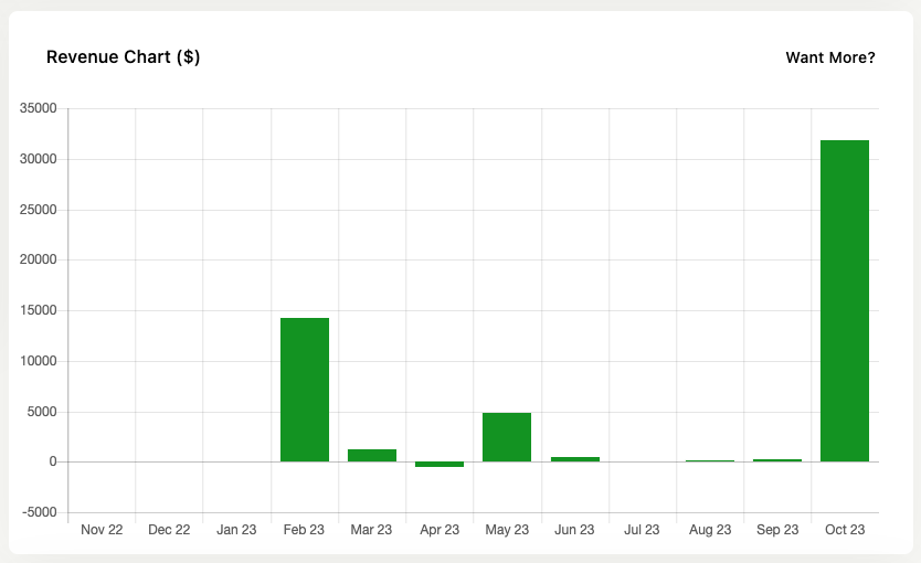
It’s a way of checking in on your sales progress over time. Is what you’re doing working, how are sales recently.
It adheres to the Jetpack CRM > CRM Settings > Transactions settings and only shows the transactions you have opted to include in the “Include these statuses in total value” section.
The colors of the bars have no meaning – they are just themed to fit the dashboard.
The Sales Dashboard extension adds more detailed revenue reports to your site.
Latest Contacts & Activity
The latest customers show you the ten most recent contacts and their statuses. This is good to check in on the latest opportunities for your business.
There’s also a section showing the latest CRM-wide activity, which you can check in to see if things are happening as expected.